UI BUILDER
UI Builder is a key design time component in AdaptiveUX that enables the ATP business users to build new UI components using a simple drag-and-drop interface.
The UI Builder leverages the underlying Material UI component library to provide options of both presentational and container components.
High Level Architecture
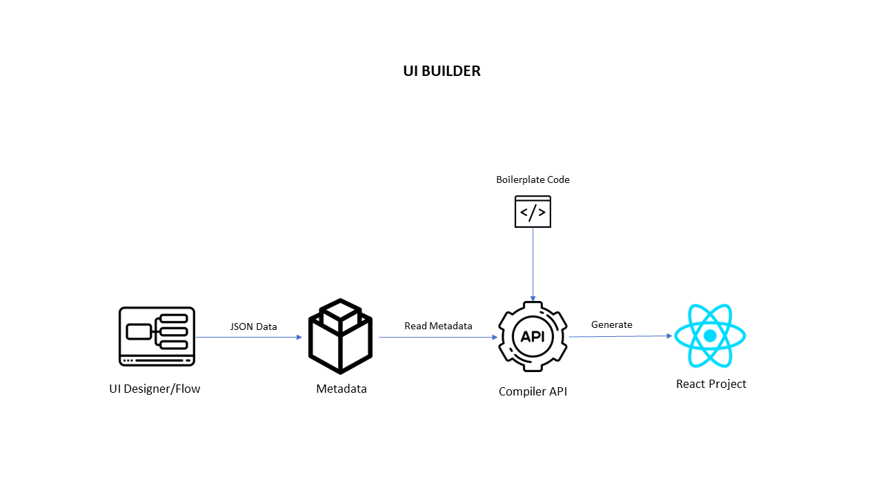
Overview
UI Builder has below areas.
- Screen list – where the list of screens will appear.
- Builder Area – Builder area have screens. Where we drag and drop the components. This where we see our Ui on the tool.
- Components – These components are from Material Ui, and some custom-made components are present there.
- Property Panel – when we click the component on the builder area, property panel will appear based on the component. These are the properties that are based on the specific component. This panel is used for editing the selected component.
Manage Screens
It has below functionalities.
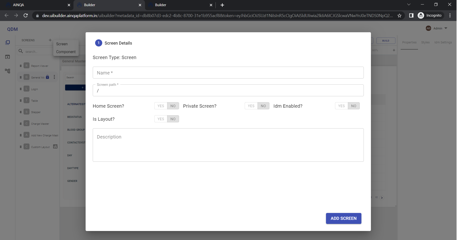
Add Screen/Component
- Click the plus icon and select screen on popover. Then dialog appears.
- Fill the screen name. Then click the add screen. Your screen will be created in the screen list area.
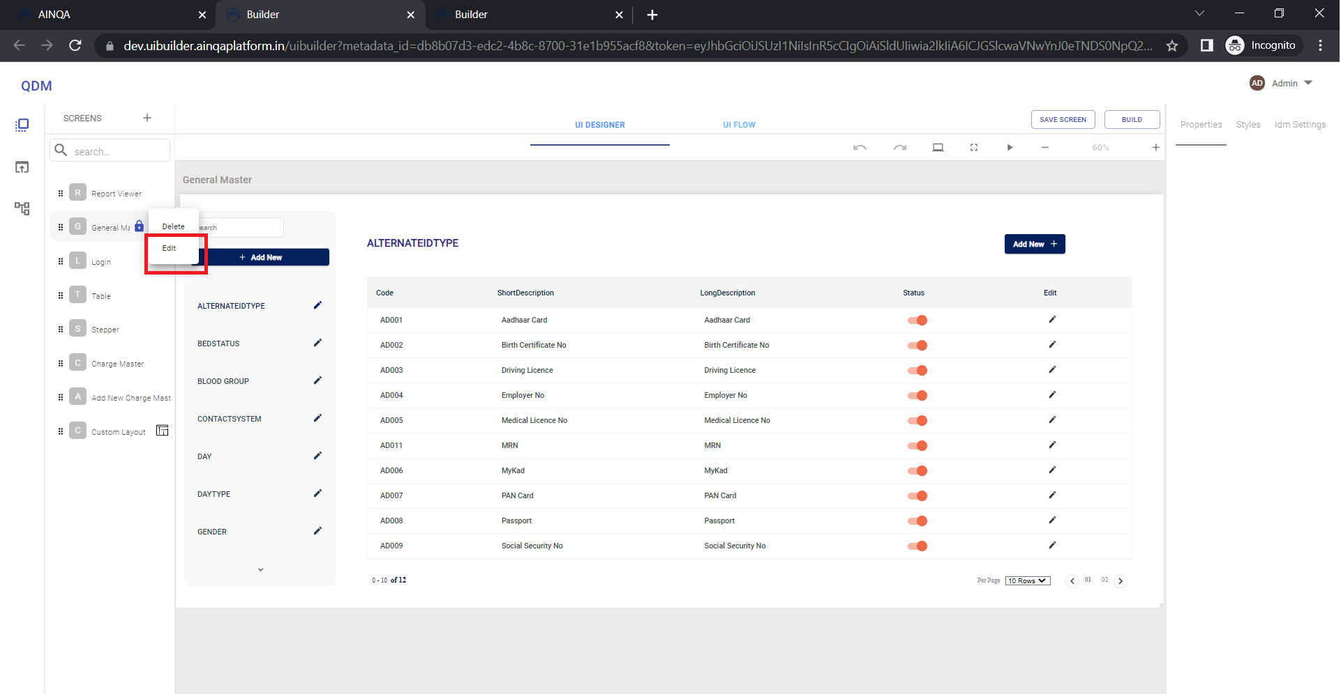
Edit Screen
Click the 3 dot button in the screen list and selecte edit option to edit screen.
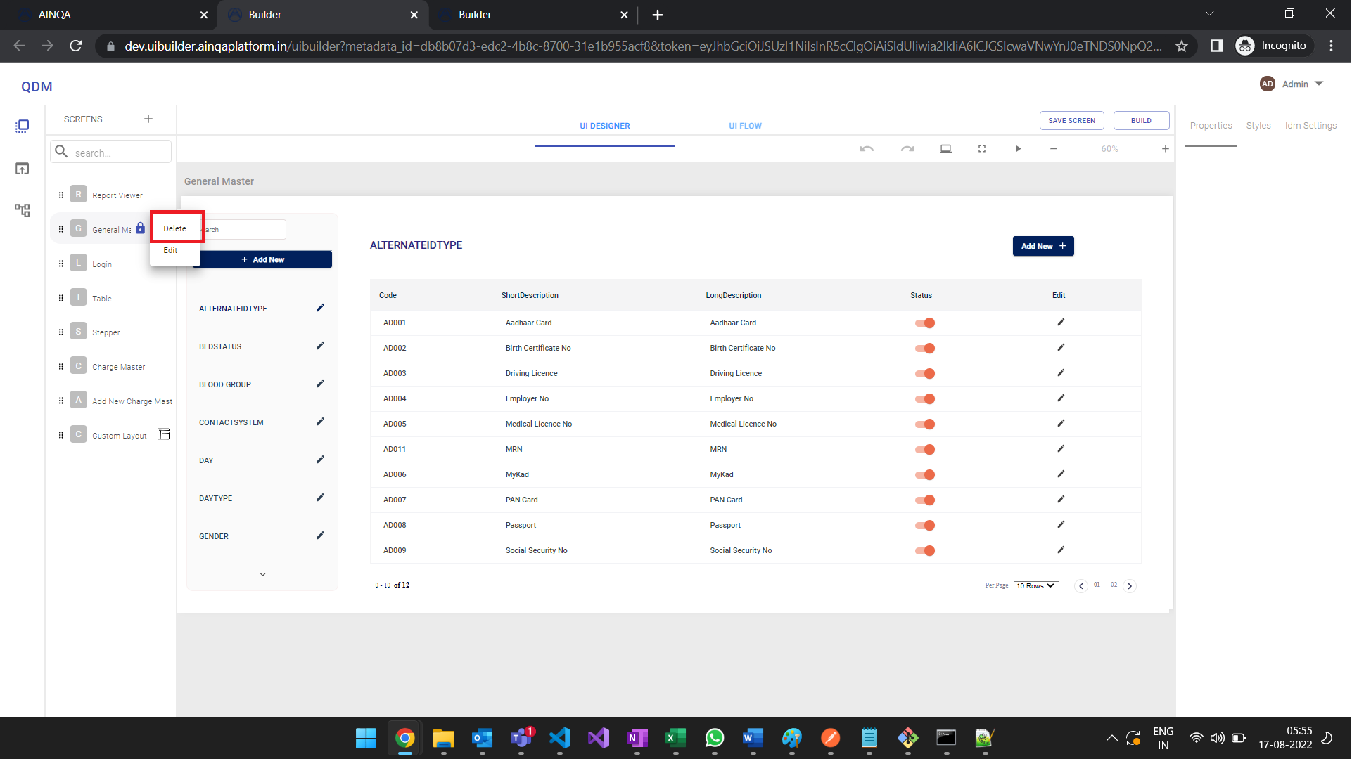
Delete Screen
Click the 3 dot button in the screen list and selecte delete option to delete screen.
Search Screen

Save Screen
Components
Primary Components
INPUTS
ButtonButton GroupCheckboxFabRadio ButtonSliderSwitchText Field
DATA DISPLAY
AvatarBadgeChipIconListListItemTextListItemAvatarListItemIconListSubheaderListItemSecondaryActionListItemTypographyCustRowTableDivider
FEEDBACK
DialogContentTextDialogDialogActionsDialogContentDialogTitleSnackbarSnackbarContentCircularProgressLinearProgress
SURFACES
CardCardContentPaperAccordionSummaryAccordionDetailsCardMediaCardActionsAccordionAccordionActionsCardActionAreaCardHeader
NAVIGATION
DrawerMenuListLinkMenuMenuItem
LAYOUTS
MuiStepperGridContainerTableContainerTableHeadTableBodyTableRowTableFooterMuiTabHiddenTableBoxCustLayout
Refer this link for complete list of primary components props & styles Primary Components
Functional Components
"Functionality As a Component"
Functional components are user defined custom components which provides a complete functionality.
Master Layout
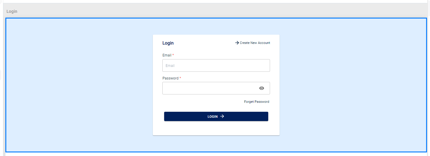
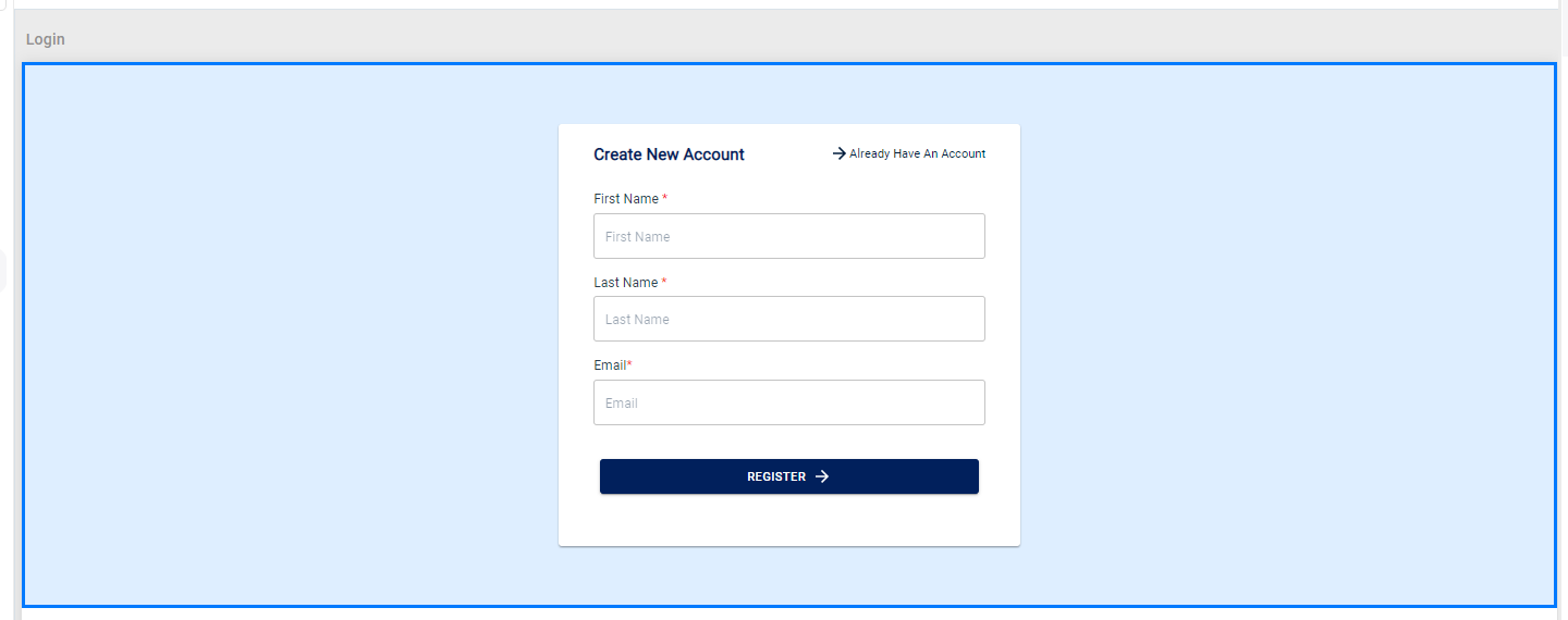
Identity Management
Login
 SignUp
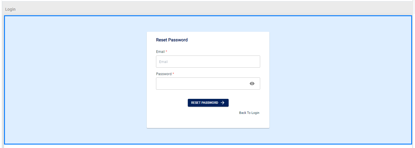
 Reset Password
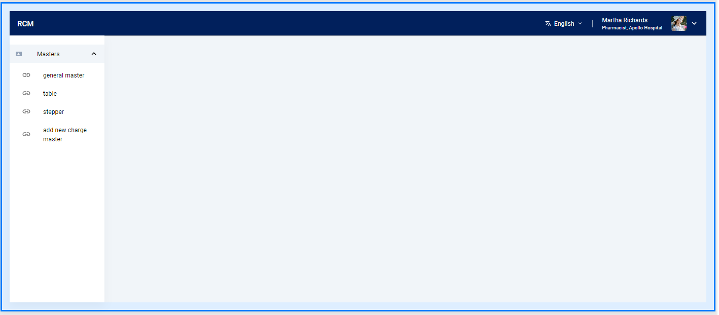
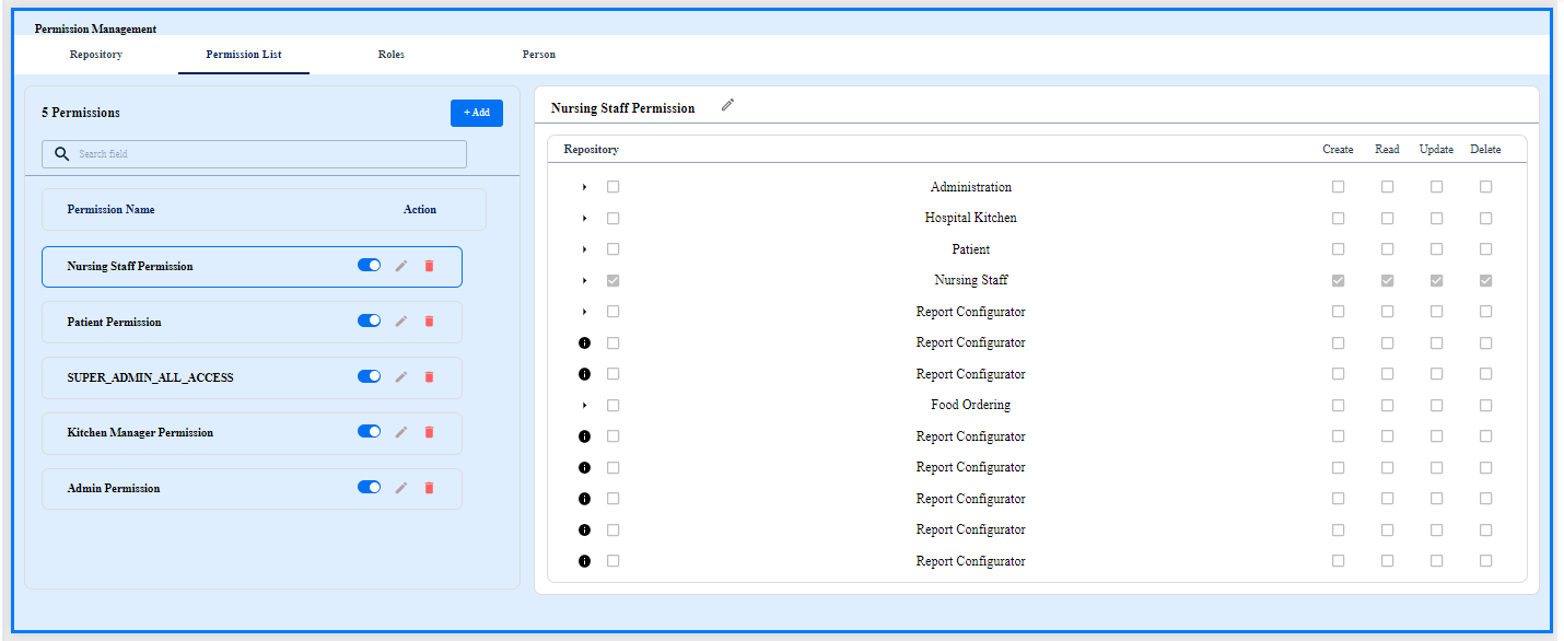
Access Management
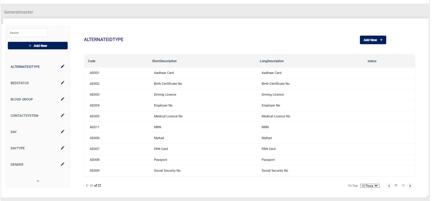
General Master
Report Viewer
Form Viewer
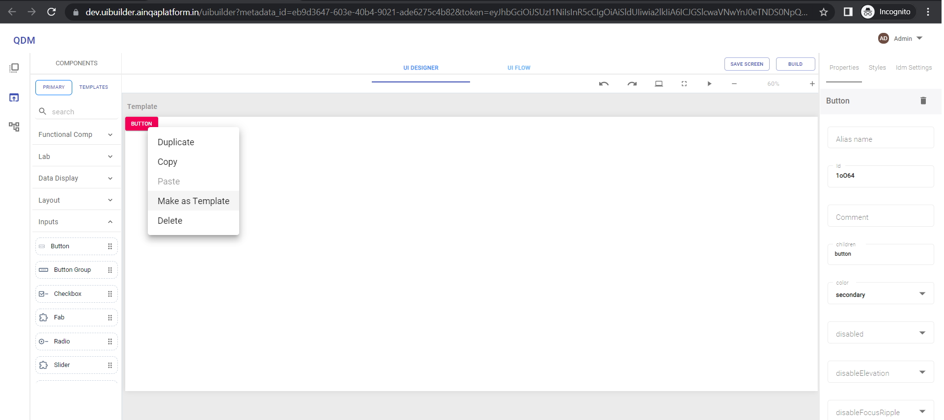
Template Components
It enables user to customize any primary components and save as template for reuse.
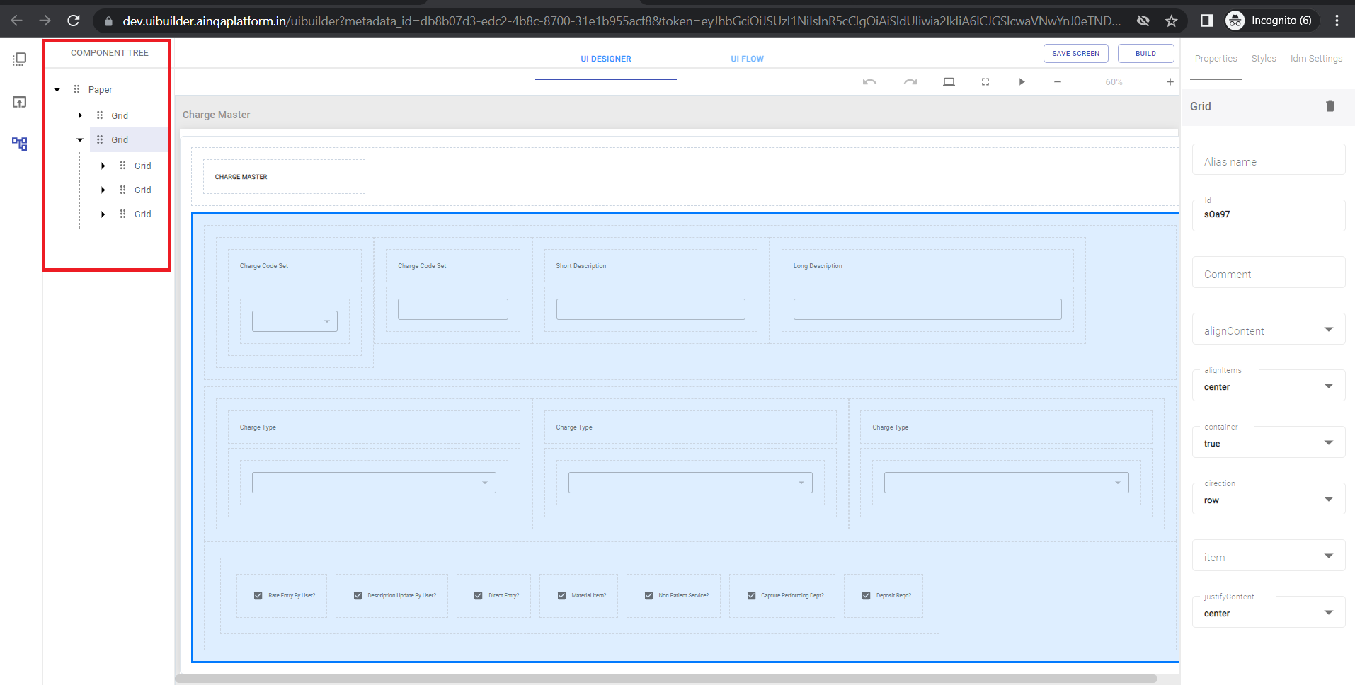
Component Tree
Component Tree is used to view layout hierarchy for easy accessibility of components used in the screen.
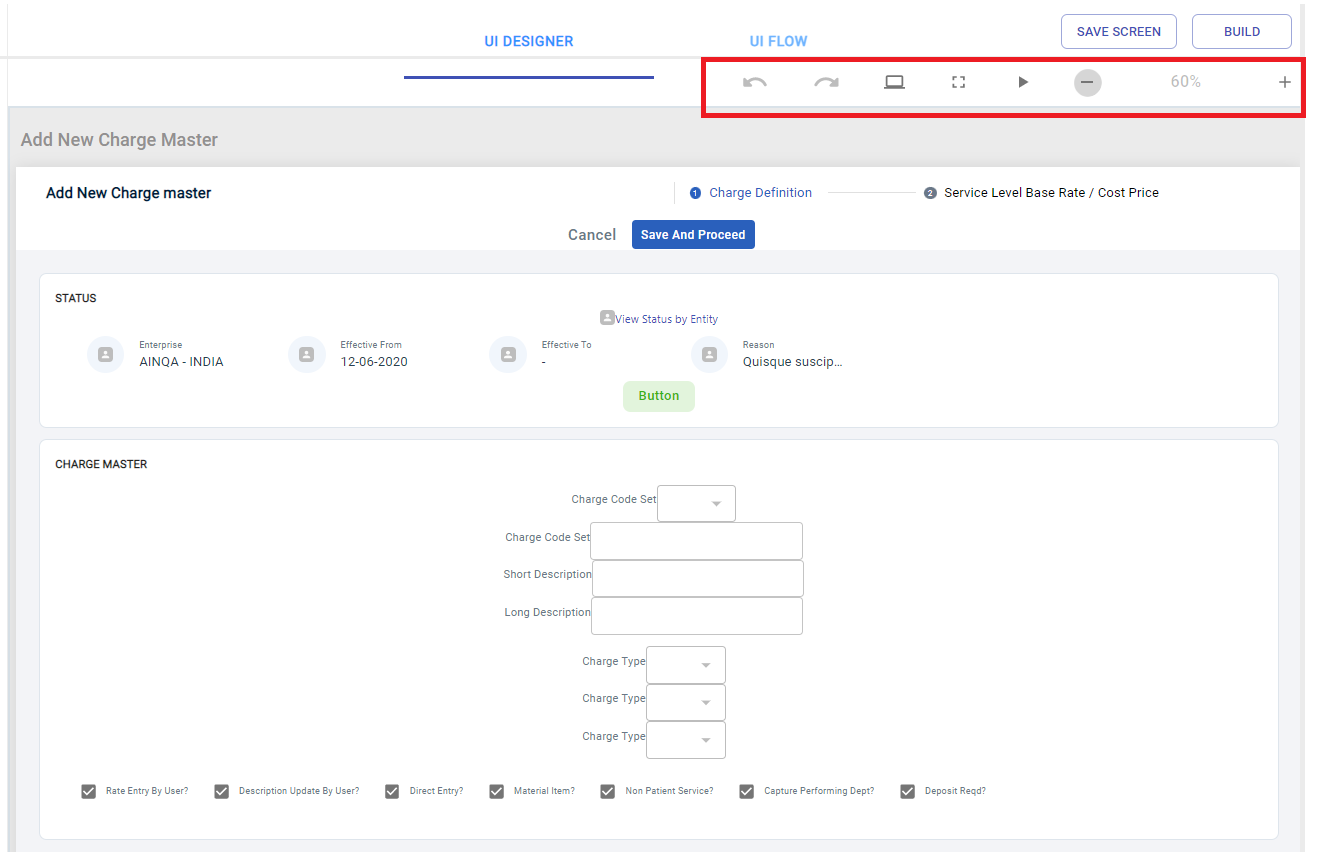
Designer Features
UI Designer has following features
- Zoom In/Out
- Full Screen
- Design Preview
- Build Preview
- Undo/Redo
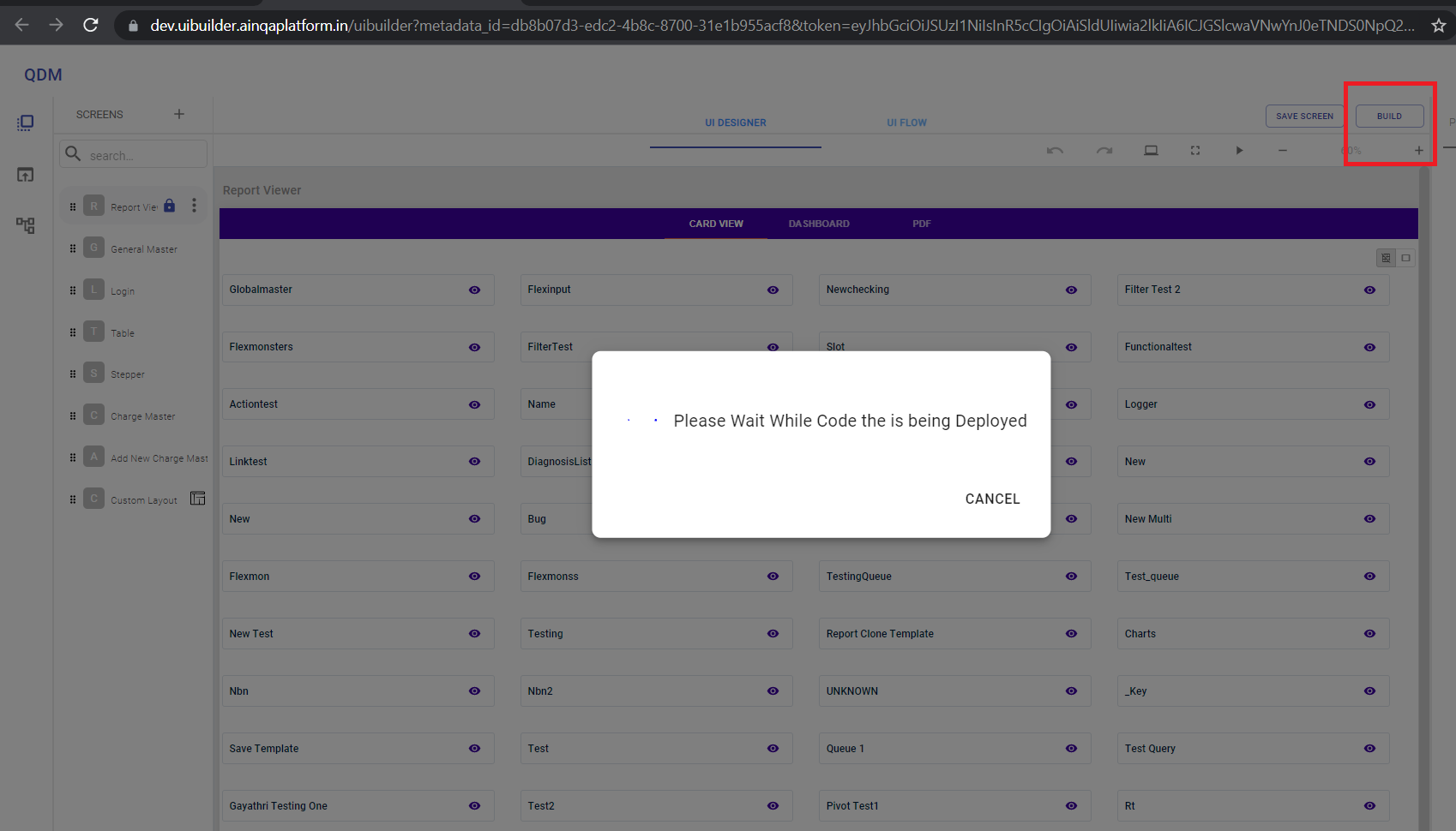
Build
It enables user to build the project and deploy the code in to github repository.