Collapse
Usage
import React from 'react'
import { Collapse } from 'qdm-component-library'
function App() {
return (
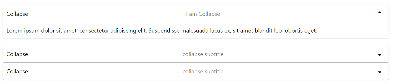
<Collapse
onClick={(e) => console.log(e.target, 'called')}
subtitle={'I am Collapse'}
body={
'Lorem ipsum dolor sit amet, consectetur adipiscing elit. Suspendisse malesuada lacus ex, sit amet blandit leo lobortis eget.'
}
open={open === 1 && true}
handleOpen={() => handleopen(1)}
title={'Collapse'}
/>
)
}
export default App
Reference
Props
className
props for providing classname to Collapse component string
id
props for providing id to Collapse component string
name
props for providing name to Collapse component string
handleOpen
props for providing toggle function to Collapse component string
children
props for providing children for Collape Component React Node
body
props for providing body for Collape Component any
openIcon
props for changing open icon of the Collape Component any
closeIcon
props for changing close icon of the Collape Component any
open
props for opening Collape Component if its false its closed boolean
title
props for providing title to the collapse component string
subtitle
props for providing subtitle to the collapse component string
url
props for providing url to show image in the collapse component string
icon
props for providing icon in the collapse component string
iconPosition
props for providing position for icon in the collapse component 'left' | 'right'
iconWidth
props for providing width for icon in the collapse component number
iconHeight
props for providing height for icon in the collapse component number
inLineStyles
props give addition props to the Collape Component type Object