Top Select
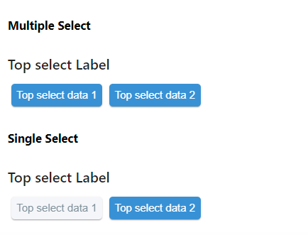
Two types of Select --- Single Select and Multiple Select.
Usage
import React from 'react'
import { TopSelect } from 'qdm-component-library'

function App() {
  return (
    <TopSelect
      label={'Top select Label'}
      options={[
        { label: 'Top select data 1', value: 'Top select data 1' },
        { label: 'Top select data 2', value: 'Top select data 2' },
      ]}
      multiple={true}
      onClick={(v) => console.log('name', v)}
    />
  )
}
export default App
Reference
options
options props used to provide data for select component Array of Objects
For example const data=[{label:male,label:female}]
onClick
this props used to change the select options Function
multiple
multiple select -- you can able to select multiple
value
this props is used select the given object initially Array of Objects
inLineStyles
props for extra styling object
nonactiveStyles
props for nonactive TopSelect Component styling object
activeStyles
props for active TopSelect Component styling object
label
props for providing label for TopSelect Component string
disabled
if its true,you cant change anything default is false boolean