Tabs
Tabs make it easy to explore and switch between different views.
Usage
import React from 'react'
import { Tab, Tabpanel } from 'qdm-component-library'
function App() {
return (
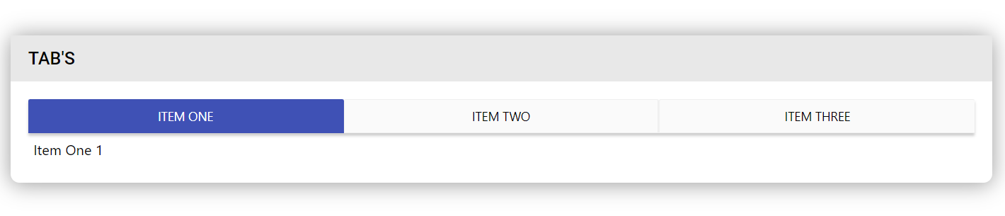
<Tab>
<Tabpanel label="Item One">Item One 1</Tabpanel>
<Tabpanel label="Item Two">Item Two 2</Tabpanel>
<Tabpanel label="Item Three">Item Three 3</Tabpanel>
</Tab>
)
}
export default App
Reference
align
If you want to align the tabs use this variable. In Qdm Component we provide 3 types of align.
- center
- left
- right
import React from 'react'
import { Tab, Tabpanel } from 'qdm-component-library'

function App() {
  return (
    <Tab align="left">
      <Tabpanel label="Item One">Item One 1</Tabpanel>
      <Tabpanel label="Item Two">Item Two 2</Tabpanel>
      <Tabpanel label="Item Three">Item Three 3</Tabpanel>
    </Tab>
  )
}
export default App
activetabs
If you want to set default active tab use this.
import React from 'react'
import { Tab, Tabpanel } from 'qdm-component-library'

function App() {
  return (
    <Tab align="left" activetabs={1}>
      <Tabpanel label="Item One">Item One 1</Tabpanel>
      <Tabpanel label="Item Two">Item Two 2</Tabpanel>
      <Tabpanel label="Item Three">Item Three 3</Tabpanel>
    </Tab>
  )
}
export default App
onChange
The onChange attribute fires the moment when the value of the element is changed.
import React from 'react'
import { Tab, Tabpanel } from 'qdm-component-library'

function App() {
  return (
    <Tab
      align="left"
      activetabs={1}
      onChange={(evt) => {
        fun(evt)
      }}
    >
      <Tabpanel label="Item One">Item One 1</Tabpanel>
      <Tabpanel label="Item Two">Item Two 2</Tabpanel>
      <Tabpanel label="Item Three">Item Three 3</Tabpanel>
    </Tab>
  )
}
export default App
inLineTabTitleStyles
If you want to customize the tab headings use this. props give addition props to the Tab element type Object
variant
4 types of variant provides different Tab UI 'standard'|'contained'|'bordered'|'withoutBordered'
inLineStyles
props give addition props to the Tab element type Object
id
props to uniquely identify string
className
props for adding classname string
name
props for addding name attribute string
children
props for providing children for tab component React Node
label
props for tab heading string
fullWidth
if true each tab takes equal width boolean
size
props for font size of the tab 'small'|'medium'|'large'
color
props for changing color of the active tab text string
backgroundColor
props for providing background color for the active tab string
elevation
props for box shadow for button group '0'|'1' |'2' |'3' |'4'
borderColor
props for changing border color string
activeColor
props for changing color for active tab string