Tap Select
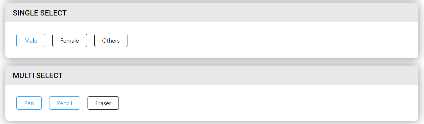
Two types of Select --- Single Select and Multiple Select.
Usage
import React from 'react'
import { TapSelect } from 'qdm-component-library'

function App() {
  const singleSelect = [
    {
      label: 'male',
      value: 'male',
      icon: (
        <svg
          class="MuiSvgIcon-root jss246"
          focusable="false"
          viewBox="0 0 24 24"
          aria-hidden="true"
        >
          <path d="M12 6c1.1 0 2 .9 2 2s-.9 2-2 2-2-.9-2-2 .9-2 2-2m0 9c2.7 0 5.8 1.29 6 2v1H6v-.99c.2-.72 3.3-2.01 6-2.01m0-11C9.79 4 8 5.79 8 8s1.79 4 4 4 4-1.79 4-4-1.79-4-4-4zm0 9c-2.67 0-8 1.34-8 4v3h16v-3c0-2.66-5.33-4-8-4z"></path>
        </svg>
      ),
    },
    {
      label: 'female',
      value: 'female',
    },
    {
      label: 'others',
      value: 'others',
    },
  ]
  return (
    <TapSelect
      options={singleSelect}
      onClick={(data) => console.log(data, 'single')}
    />
  )
}
export default App
Reference
options
options props used to provide data for select component Array of Objects
For example const data=[{label:male,label:female,icon:<svg>}]
onClick
this props used to change the select options Function
type
Two types of Select 1.single select -- you can able to select only one 2.multiple select -- you can able to select multiple
fullWidth
if this props is true each select div takes eqaul width boolean
selectedBorderColor
this props is used to change the active border color of the select division string
selectedBackgroundColor
this props is used to change the active background color of the select division string
selectedTextColor
this props is used to change the active font color of the select division string
textSize
this props is used to change the font size of the select division number
textColor
this props is used to change the font color of the select division number
iconWidth
this props is used to change the icon width if you provide icon number
iconHeight
this props is used to change the icon height if you provide icon number
defaultSelected
this props is used select the given object initially Array of Objects
inLineStyles
props for extra styling object
iconPosition
props for aligning icon or images left or right